Logo + Branding
Graphic Design

After a cease and desist letter from an infamous Multi-level Marketing brand concerning the close resemblance of their logo, Kush Bottles needed a new brand identity. As the premier cannabis packaging company, they also needed a logo and identity that was engaging and resonated with their clients. The logo is modeled off of their number one product, the pop top, which can be seen as the left rectangular shape on the “K” in the logo. The green color came from the custom color of their house pop-top, lime green. This color along with a custom groovy font are carried throughout the company’s branding.

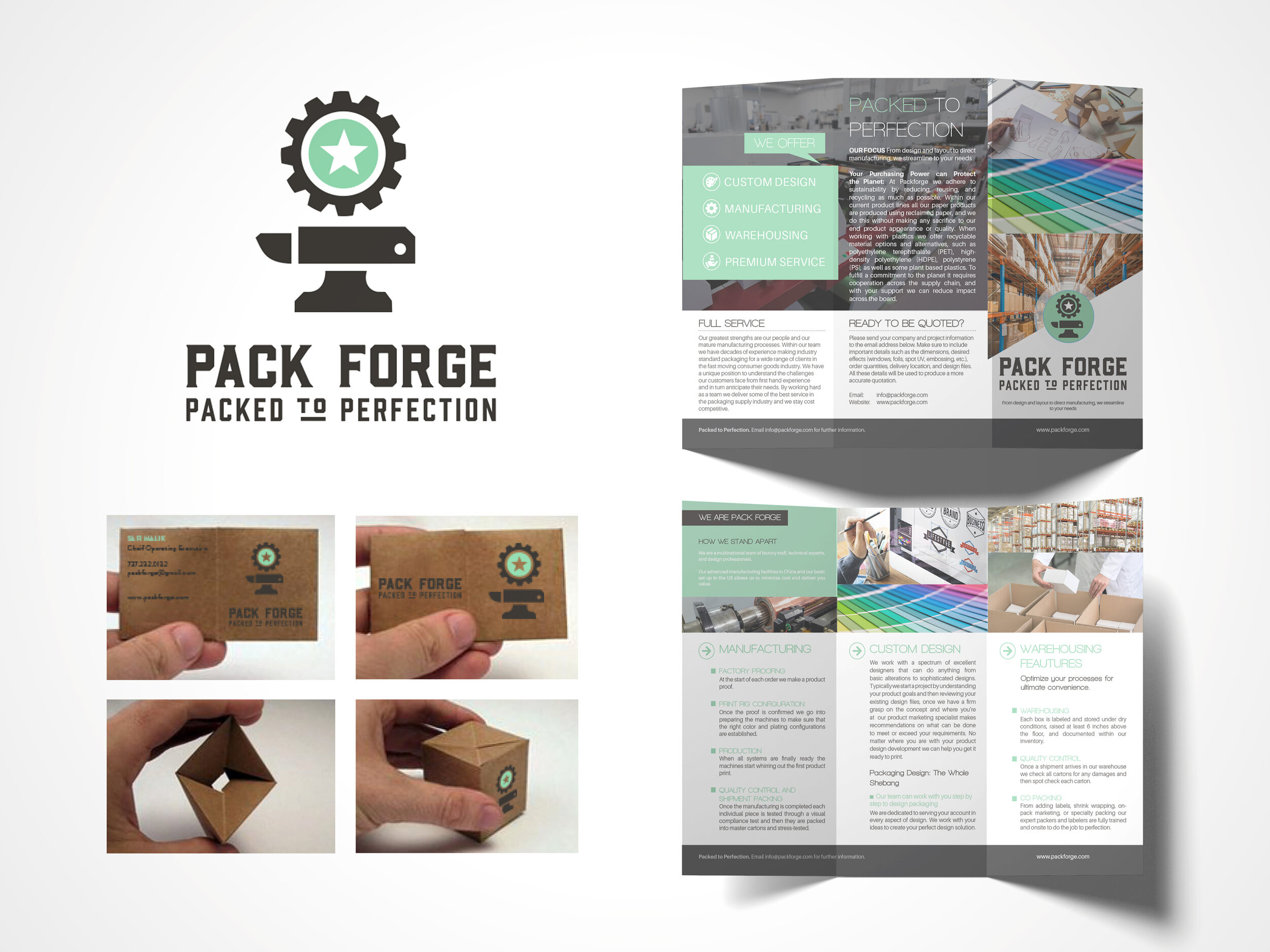
Pack Forge, a manufacturing and packaging company based out of Southern California, needed a logo and branding that set it apart from its competitors. Using heavy fonts and milky teal green as an accent color, we balanced the masculine and feminine to create something completely original for the stereotypically rough and gruff industry look.

Honest Earl’s knew exactly what they wanted when they were looking for a new logo and brand identity: keep it classic. And that’s exactly what we did. The formula of the product was developed in the late 60’s by Earl himself and we wanted to pay homage to the early days of this products creation. It is also all natural, making it easy to choose soft, easy greens for the logo color.

Grab your pickaxes and sand sifting gear! Western Mining Archaeology, a company that specializes in sourcing and showing vintage mining artifacts, needed a new logo that encapsulated their spirit and values. Using a hand illustrated, custom font, we took them back to the Wild-Wild-West and created a poster along with the logo for their upcoming event.

Golden Bee Hemp requested a logo that was as reliable and soothing as their product, an all-natural CBD pain salve that works better than any store-bought paint ointment. Made with all vegan ingredients, the bee needed to be front and center to celebrate the fact that no bees were harmed in the making of the product.

Chef Rick Boxeth, a classically trained, multitalented cuisine expert, created the perfect salted caramel and wanted his logo and identity to be just as special as his confections. Hailing from Santa Ana, California (my hometown!), he wanted to harken back to the timeless look of art deco design. We incorporated rich browns and gold and well as a custom art deco font for his branding suite.


